
Creating a Brand: Crystal Danielle Coaching
In the world of life coaching, the market is incredibly saturated. For many coaches, the ‘industry standard’ is a sea of beige, soft whites, and generic ‘zen’ imagery. It’s professional, but it often lacks the one thing a client needs to truly connect with a coach: personality.
Crystal is a client I’d worked with on projects before, but when she told me she was soon to qualify as a life coach, I jumped at the chance to help her create her brand and digital presence from scratch - one that truly feels like her, and could help her stand out to prospective clients. She didn’t want to be another ‘stuffy’ coach in a sea of neutrals. You only have to take one look at Crystal to see how vibrant and incredibly stylish she is - a unique blend of high-fashion class and genuine warmth.
The goal was clear: Create a brand that felt as immaculate and welcoming as Crystal herself.
The Vision: Classy, Colourful, and Kind
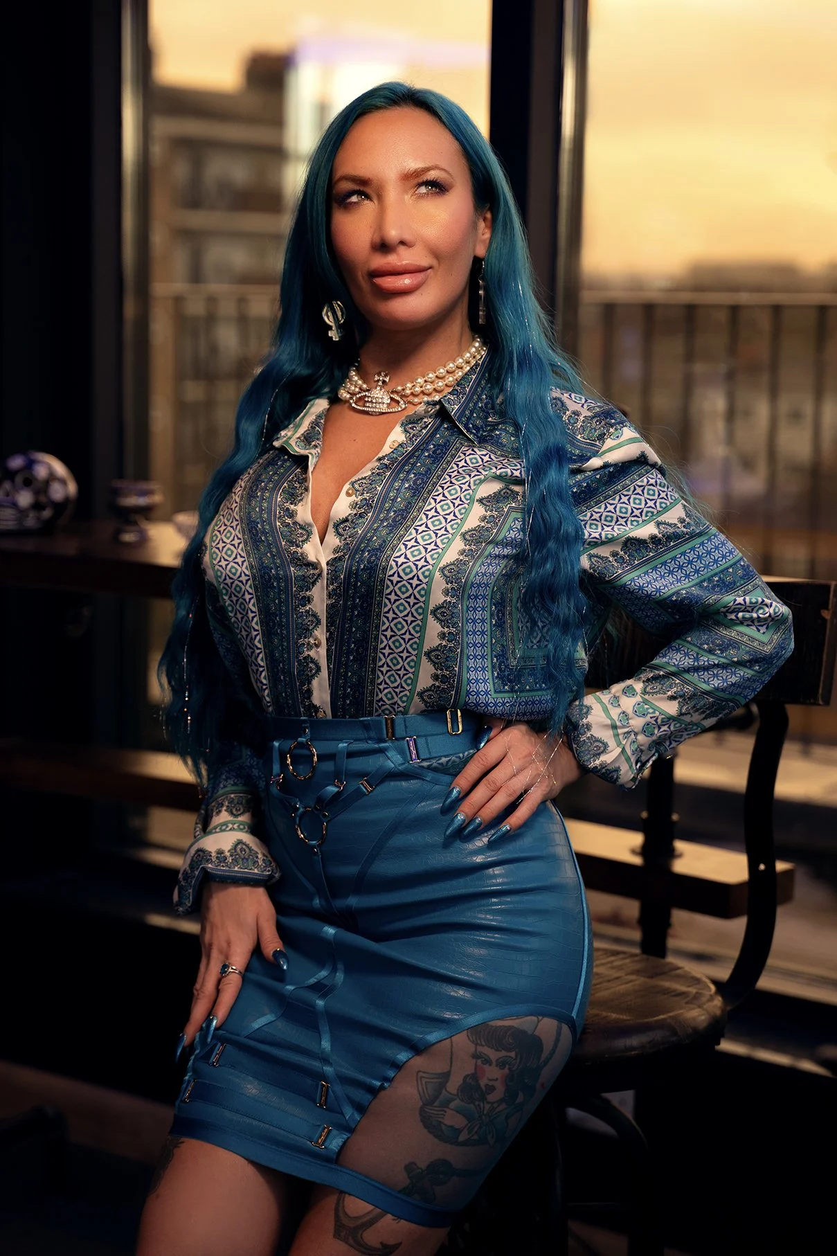
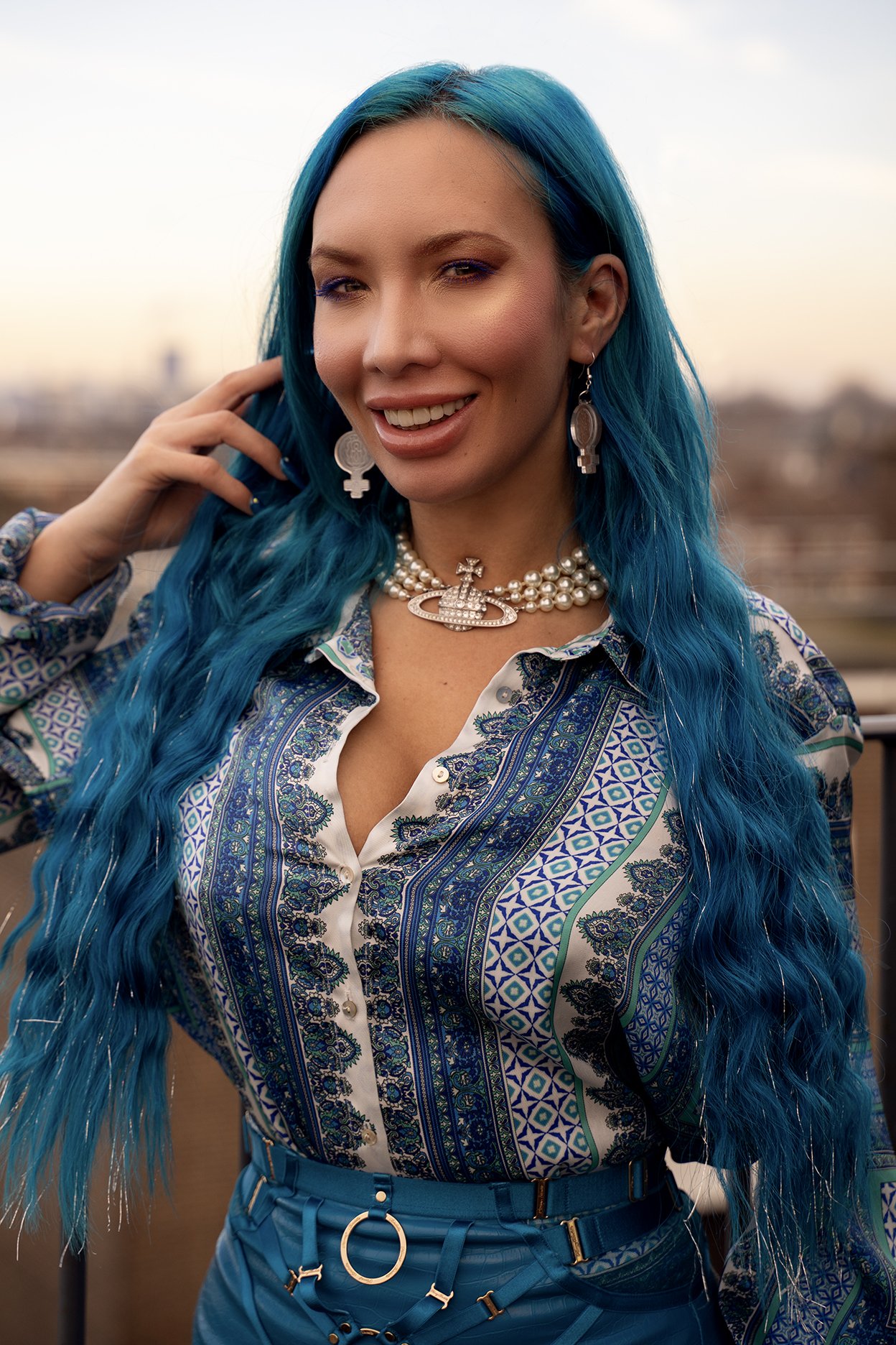
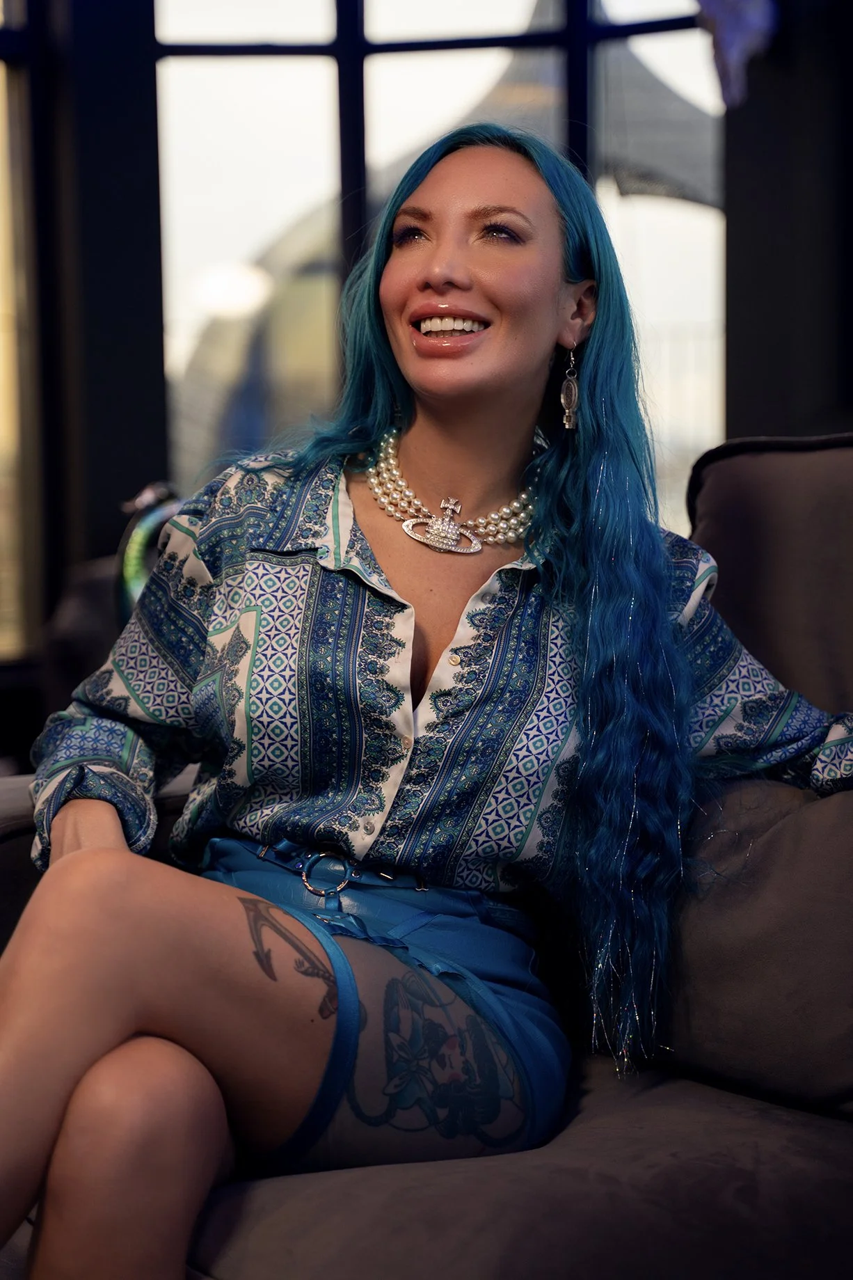
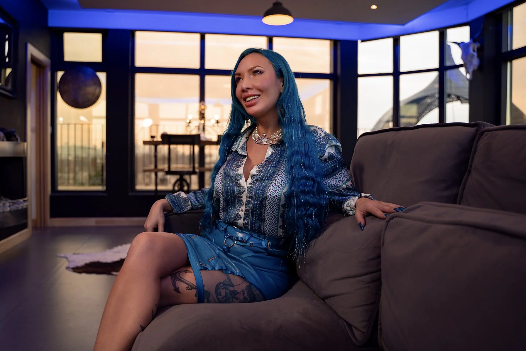
Crystal is not your typical life coach. With her striking long blue hair and an impeccable sense of style, she brings a visual energy that is both bold and sophisticated. But beneath the high-fashion exterior is someone incredibly sweet and generous.
The challenge was to bridge that gap - to create a brand that felt high-end and ‘classy’ without losing the warmth and uniqueness that makes Crystal who she is.
The Process: From Photoshoot to Palette
Rather than picking a colour palette from a trend board, we started with the most authentic element: Crystal herself.
1. The Photoshoot as a Foundation
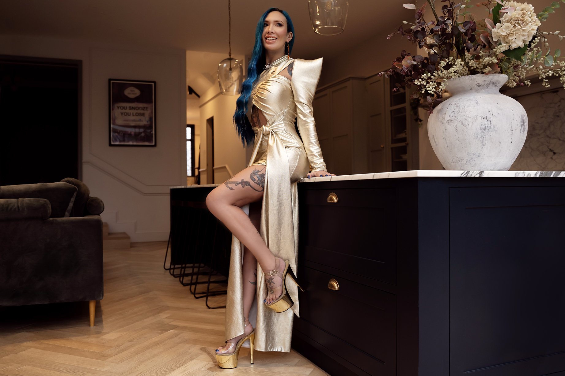
We began with a bespoke photoshoot. By capturing Crystal in her element, we were able to identify a natural colour story. The vibrant blue of her hair and the elegance of her styling provided the anchor for the entire brand.
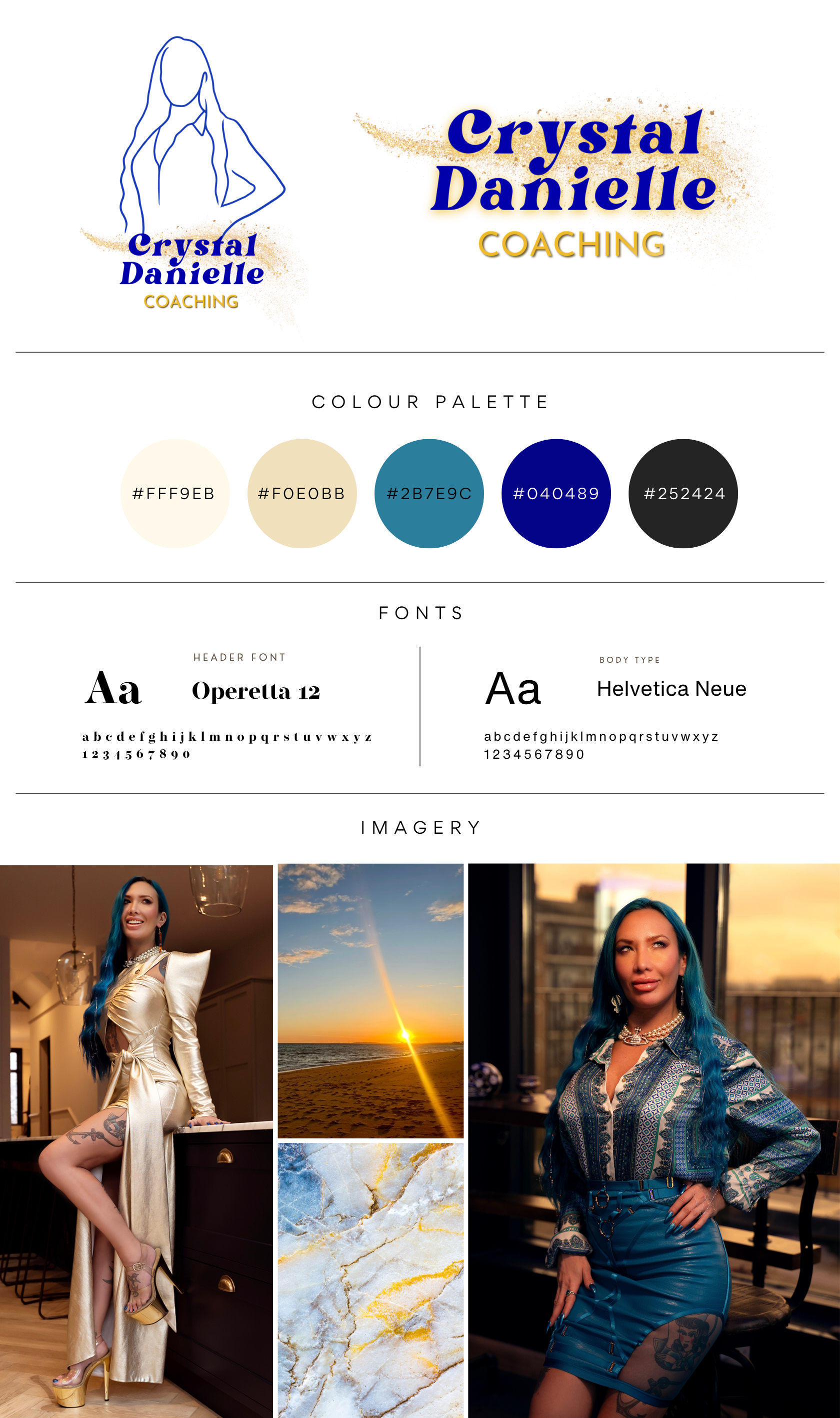
2. Defining the Palette: Blue, Gold, and Cream
From the images, we extracted a palette of deep blues, shimmering gold, and soft cream.
Blue represented her striking individuality, and her iconic hair
Gold added the element of luxury, class, and ‘premium’ service.
Cream provided the warmth and serenity essential for a coaching practice.
To expand this look, I curated a library of supporting imagery - incorporating the timelessness of white marble (something Crystal specifically asked for) and the peace of serene nature scenes - all tied together by that same cohesive colour palette.
3. The Logo: A Personal Touch
For the logo, I wanted something that felt bespoke and intimate. I decided to trace the silhouette of Crystal from one of our photos, creating a mark that is literally a reflection of her. To add that final touch of ‘Crystal magic’, I incorporated a swish of glitter - a nod to her vibrant personality and the sparkle she brings to her clients' lives.
4. The Digital Home: A Bespoke Website
The final piece of the puzzle was a website that functioned as a welcoming portal to her coaching practice. By integrating the custom photography, the silhouette logo, and the gold-and-cream aesthetic, the website became more than just a page of information - it became a digital extension of Crystal's personality. The copy for the website was written by Crystal and sub-edited by me, and we made sure to also include some testimonials from some of her practice clients.
The Result: Standing Out in a Saturated Market
Crystal now has a brand that does what generic branding cannot - it tells the truth about who she is.
She doesn't have to pretend to be a ‘traditional’ coach to be taken seriously. Instead, her visuals communicate that she is a professional who is also unique, stylish, and deeply human. She no longer blends into the background; she stands out as a premium choice for clients who are looking for a coach with a bit of magic.
Tired of the ‘industry standard’ and ready for a brand that actually feels like you?
Whether you're a coach, a creative, or a wellness professional, let's build a visual identity that captures your unique spark.