
Creating a Brand: Weller Fitness
When Helen Weller - a passionate, queer personal trainer -approached me, she had a clear goal: to niche down and build a brand that speaks directly to the LGBTQ+ community. Together, after discussing her target market and her goals, we created Weller Fitness - a name that feels strong, personal, and rooted in her identity.
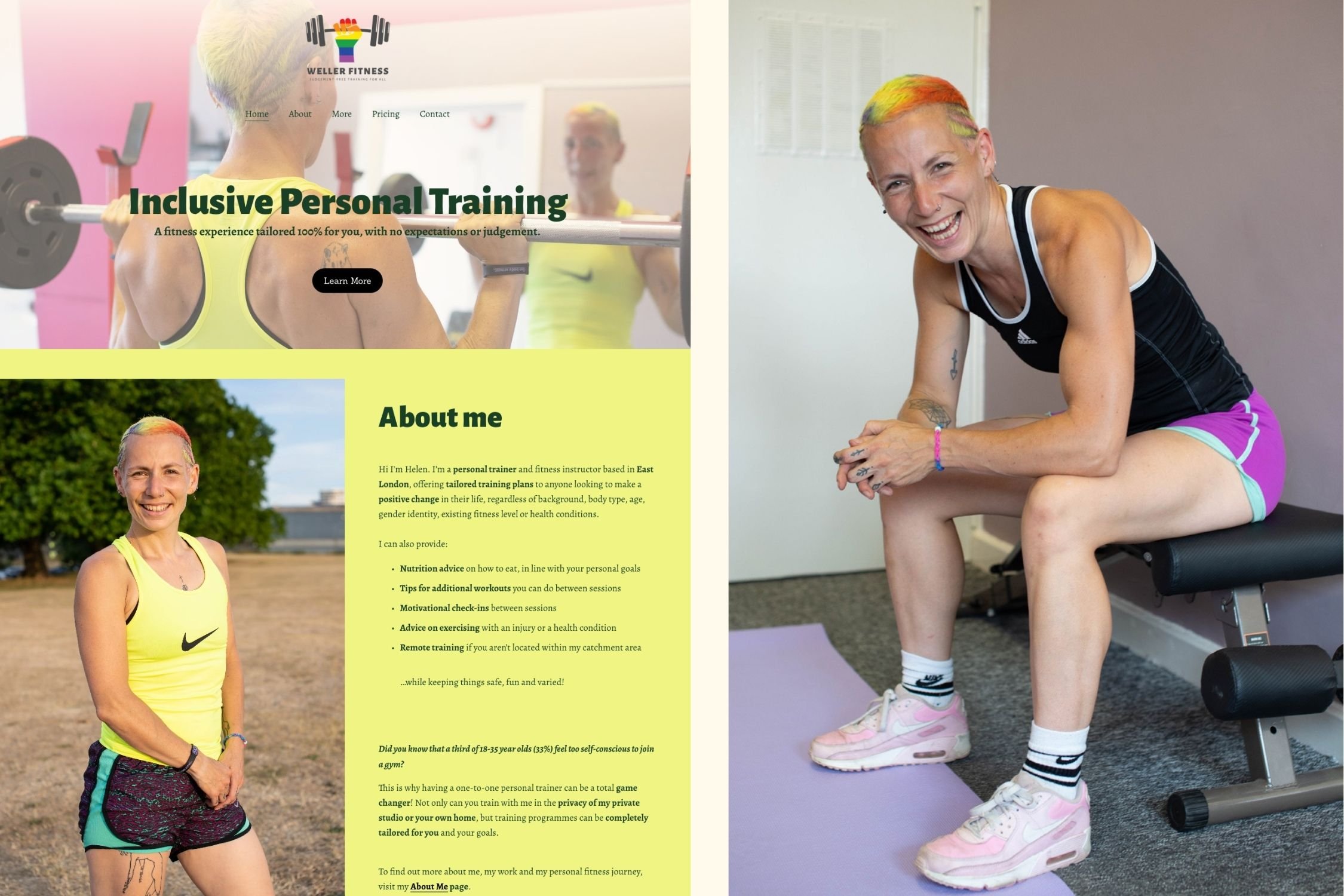
First, I crafted a bold logo that speaks to her client base. Then, we spent an afternoon working on a promo shoot with a group of models, using both her studio and a nearby park as our locations. The resulting images then inspired our vibrant colour palette.
From there, I built Helen an 8-page Squarespace website using these colours, paired with the same confident, modern font used in her logo.
The result is a brand identity that's unapologetically Helen - proud, bold, fun and authentic.
Feeling inspired? Get in touch with me today to arrange a free consultation call.

The Weller Fitness Branding Kit
The importance of colour is something I really don’t like to shy away from! A monochrome look can sometimes be effective in itself - but when it comes to working with solopreneurs and individual service providers, most people have their own personal style and aesthetic.
To truly make your branding feel aligned with who you are, it needs to feel like an extension of you - this can be evoked not only through a colour palette, but the choice of fonts, layout, textures and photo shoot locations. Your brand an expression of yourself in the same way that you dress, style your hair and decorate your home - so don’t leave it as an afterthought!
This is where I can help - I’m able to pick out what it is about you that makes you unique, and can help you discover how to apply that to your branding.